← Selected work
Identity, motion & digital / 2016

Rock the Rock Concert

Give an event the energy of its audience.

Rock the Rock called for a visual world that connected music, place, and an anti-poaching cause. For this festival campaign project, I developed the identity, animation studies, website concepts, and promotional video, exploring how the same direction could carry across a mark, an interface, and a moving image.

My contribution
Visual identity, motion, website concepts & promotional video
Design focus
Connect the energy of a rock festival with its setting and cause.
Decisions behind the work
01

Explore before committing

Sketches were narrowed to three developed directions, then one mark connecting location and music.

02

Revise the interaction model

An expanding single-page concept gave way to more clearly defined content areas and persistent navigation.

03

Direct attention through pacing

Short, rhythm-led edits foreground concert energy while giving key messages time to register.

Rock the Rock Concert — Rock the Rock Concert, visual 1

Give the event a coherent direction.

The intended 18–35-year-old rock audience guided the campaign’s energy, while the event’s location and cause gave the identity a more specific focus.

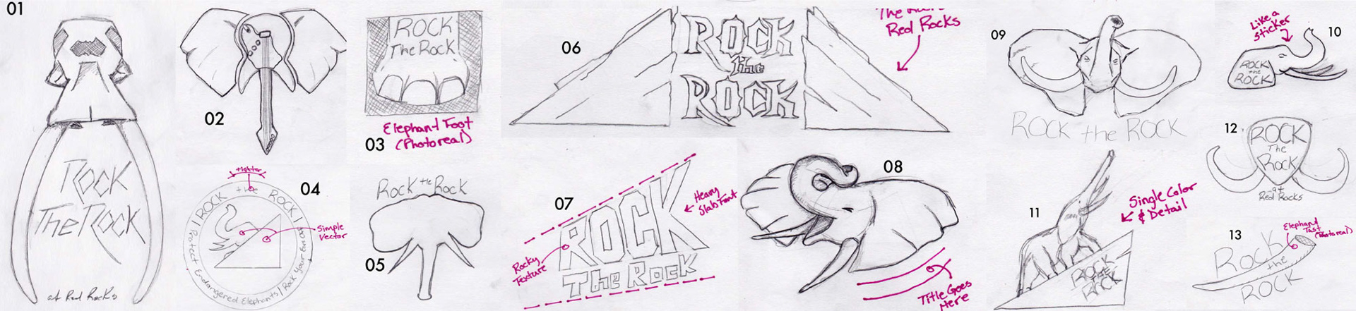
Explore and compare.

Early sketches examined several directions before three were selected for further development.
Rock the Rock Concert — Explore and compare., visual 2

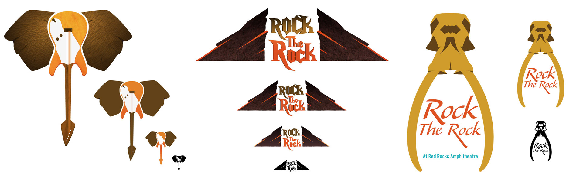
Each shortlisted direction was developed to a near-final mockup, with versions for different scales.
Rock the Rock Concert — Explore and compare., visual 3

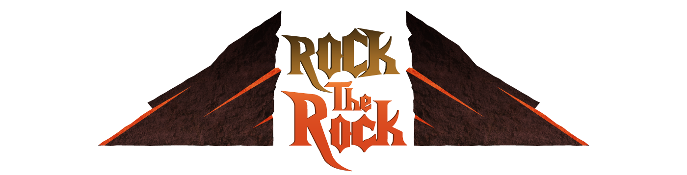
The selected mark brings together the event’s location and style of entertainment.
Rock the Rock Concert — Explore and compare., visual 4

Use motion to express character.

The animation studies were developed in After Effects with commercial-use generators and finalized in Final Cut Pro.

The first study uses sound, embossing, dust, and camera shake to convey weight. The impact is carried by the environment rather than a bouncing mark.

Use motion to express character.

Loads content from an external media provider.
Open media in a new tab ↗

The second trades a music bed for fire sounds and flicker, exploring the event’s outdoor character and a sense of danger.

Use motion to express character.

Loads content from an external media provider.
Open media in a new tab ↗

The third builds anticipation through a sense of travel, then resolves it in an energetic reveal of the location and identity.

Use motion to express character.

Loads content from an external media provider.
Open media in a new tab ↗

Refine how people find the content.

Rock the Rock Concert — Refine how people find the content., visual 5

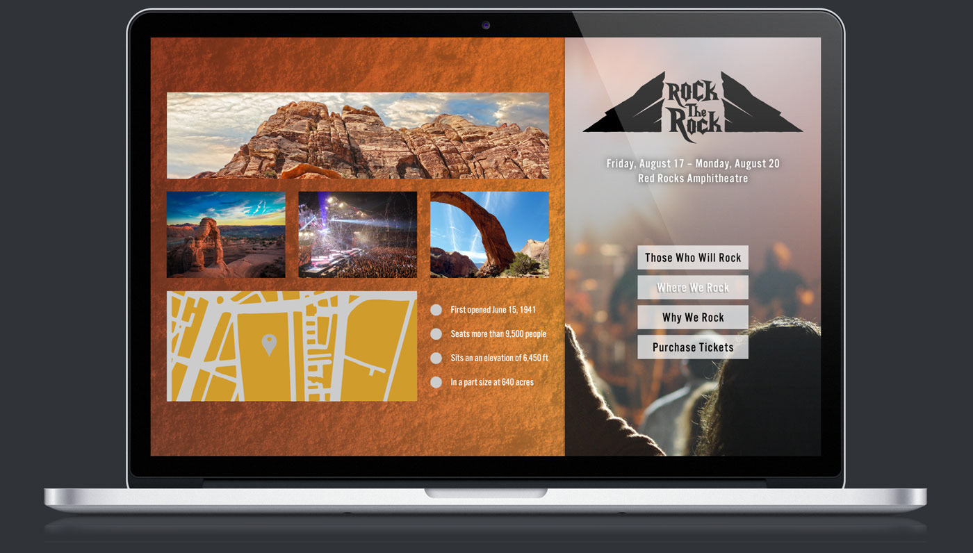
The first website concept used expandable content on a single page. I reconsidered it because the content areas felt insufficiently defined and the visual direction had moved away from the audience.
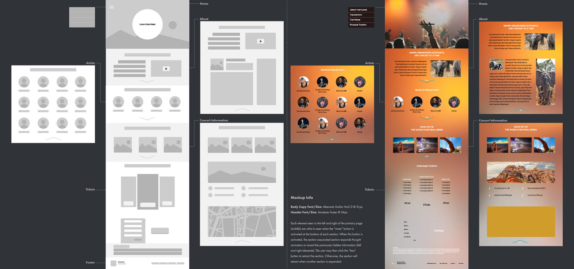
Rock the Rock Concert — Refine how people find the content., visual 6

The revision separates persistent navigation from changing content, making the information structure more explicit.
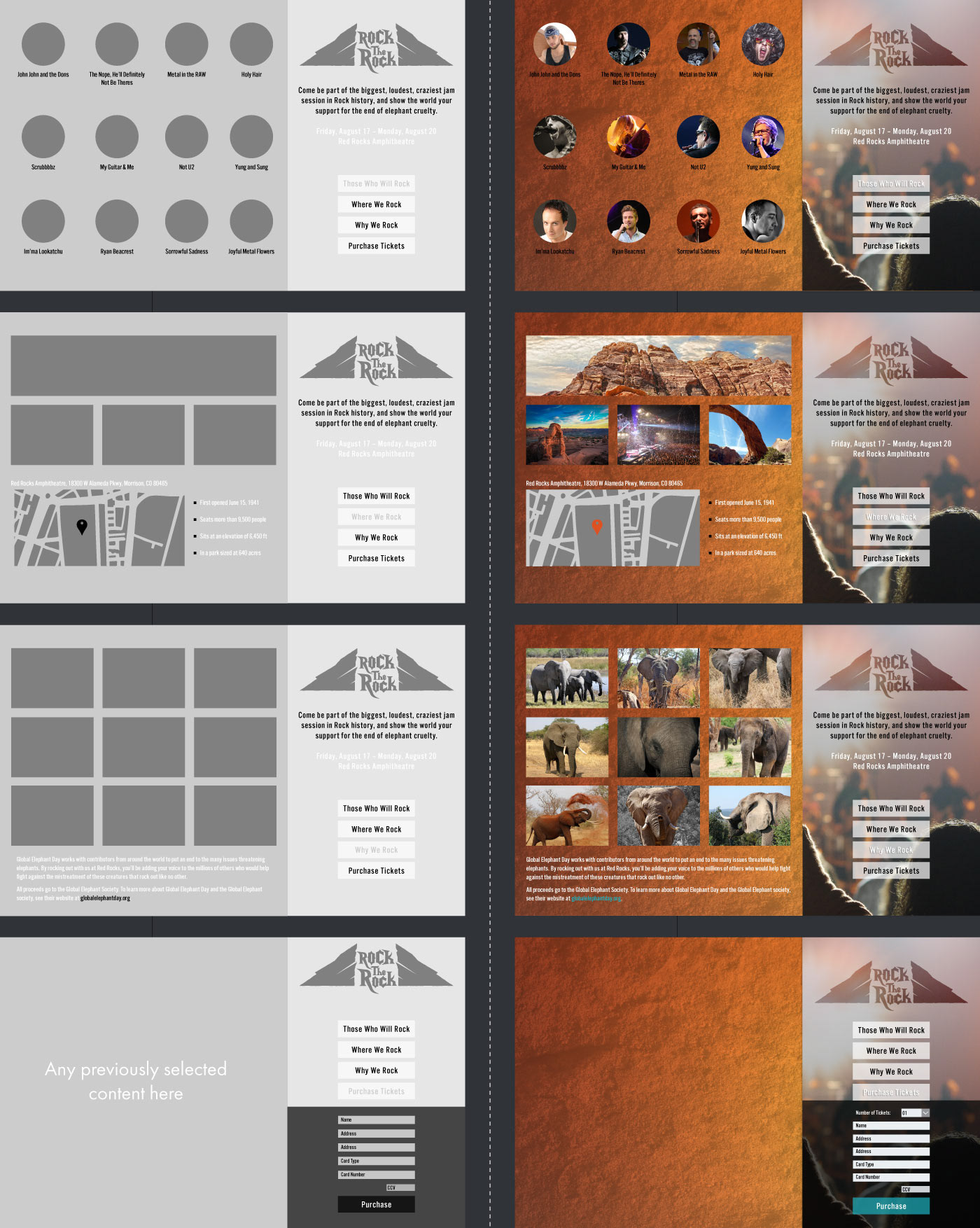
Rock the Rock Concert — Refine how people find the content., visual 7

The modular layout also proposed an overlay navigation treatment for smaller screens.
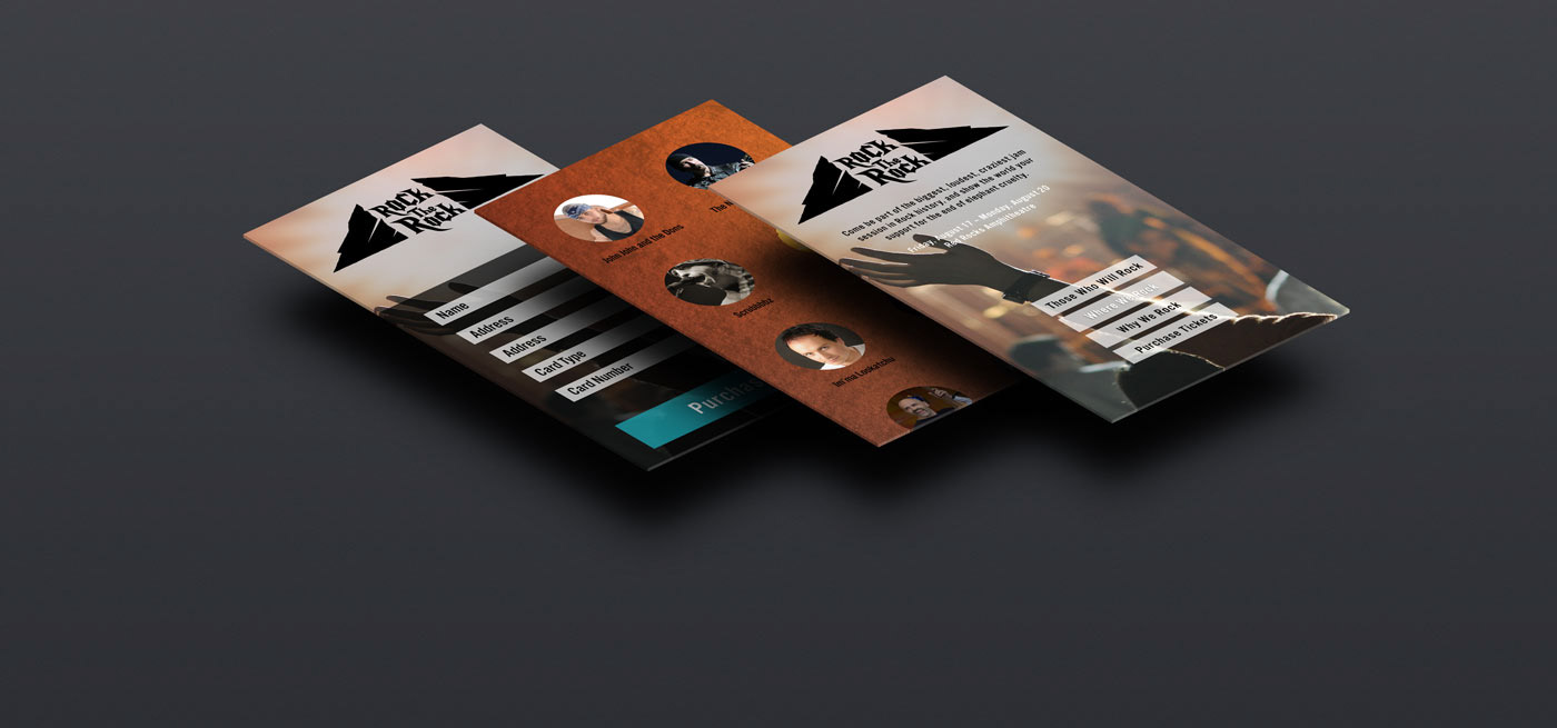
Rock the Rock Concert — Refine how people find the content., visual 8

A presentation explained the interaction and design rationale before committing to full development. The work shown here is a website concept.

Refine how people find the content.

Loads content from an external media provider.
Open media in a new tab ↗

Balance the cause with the invitation.

The promotional video briefly introduces the anti-poaching cause, then emphasizes the concert’s energy. Short clips and near-matched music tempos establish pace; longer holds support readability. Transitions mark meaningful changes rather than decorating every cut.

Balance the cause with the invitation.

Loads content from an external media provider.
Open media in a new tab ↗
Next projectFood Bank NYC View all work