← Selected work
Brand identity & motion / 2017

Native

An identity grounded in togetherness and momentum.

How can civic education feel relevant to people with little time to navigate government? For this graduate-school project, I developed Native in response to a civic-education campaign brief. The academic proposal spans naming, visual identity, animated logo studies, and stationery, with belonging and participation guiding the direction.

My contribution
Graduate-school project: visual identity, animated logo studies & stationery
Design focus
Make a civic-education campaign feel connected, approachable, and capable of moving people toward participation.
Decisions behind the work
01

Interpret the civic-education brief

The campaign was intended to help people with limited time and resources navigate government functions and agencies.

02

Make the name an invitation

Native connects civic participation with ownership and belonging, while moving away from familiar civic- and citi-based names.

03

Adjust the tone to the context

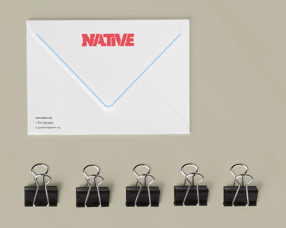
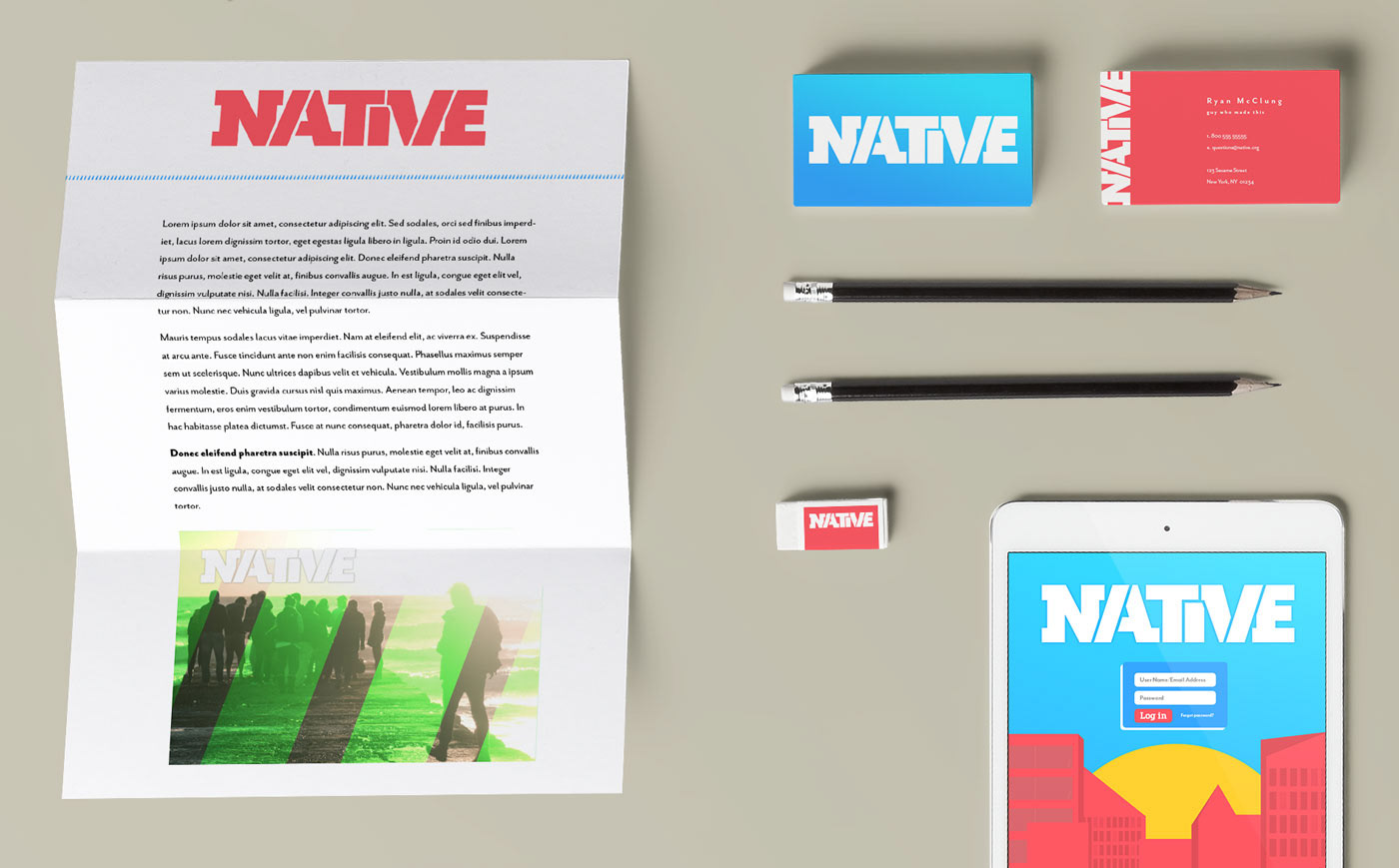
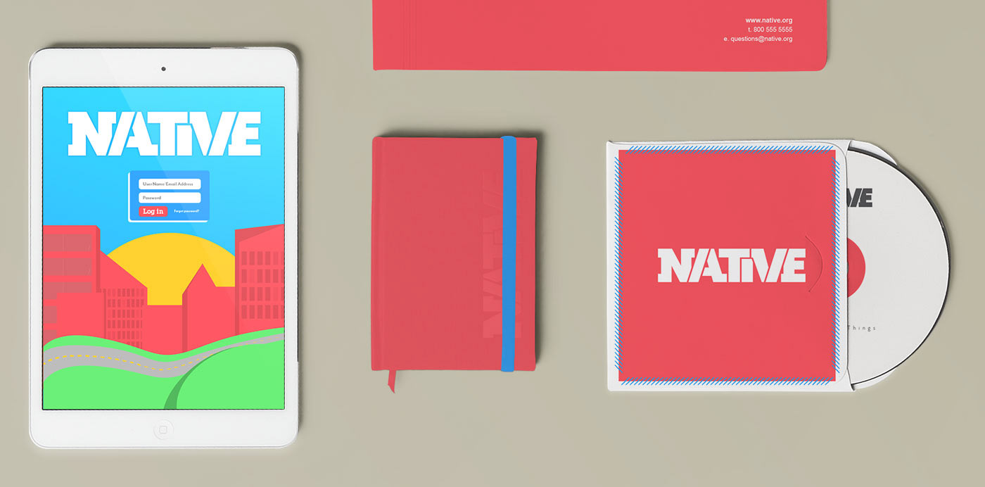
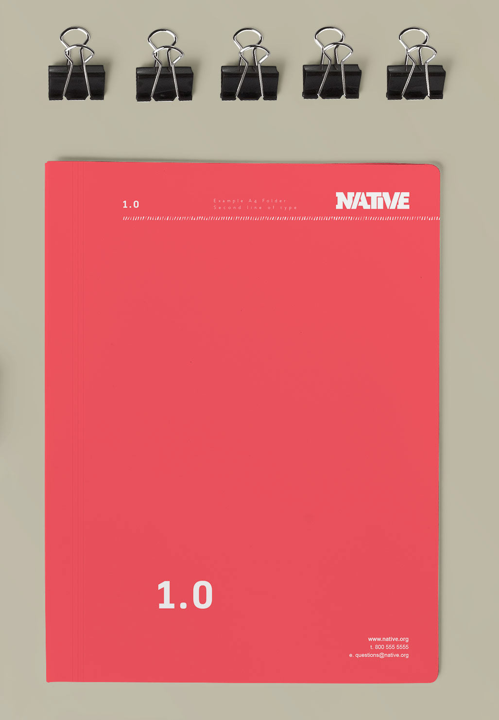
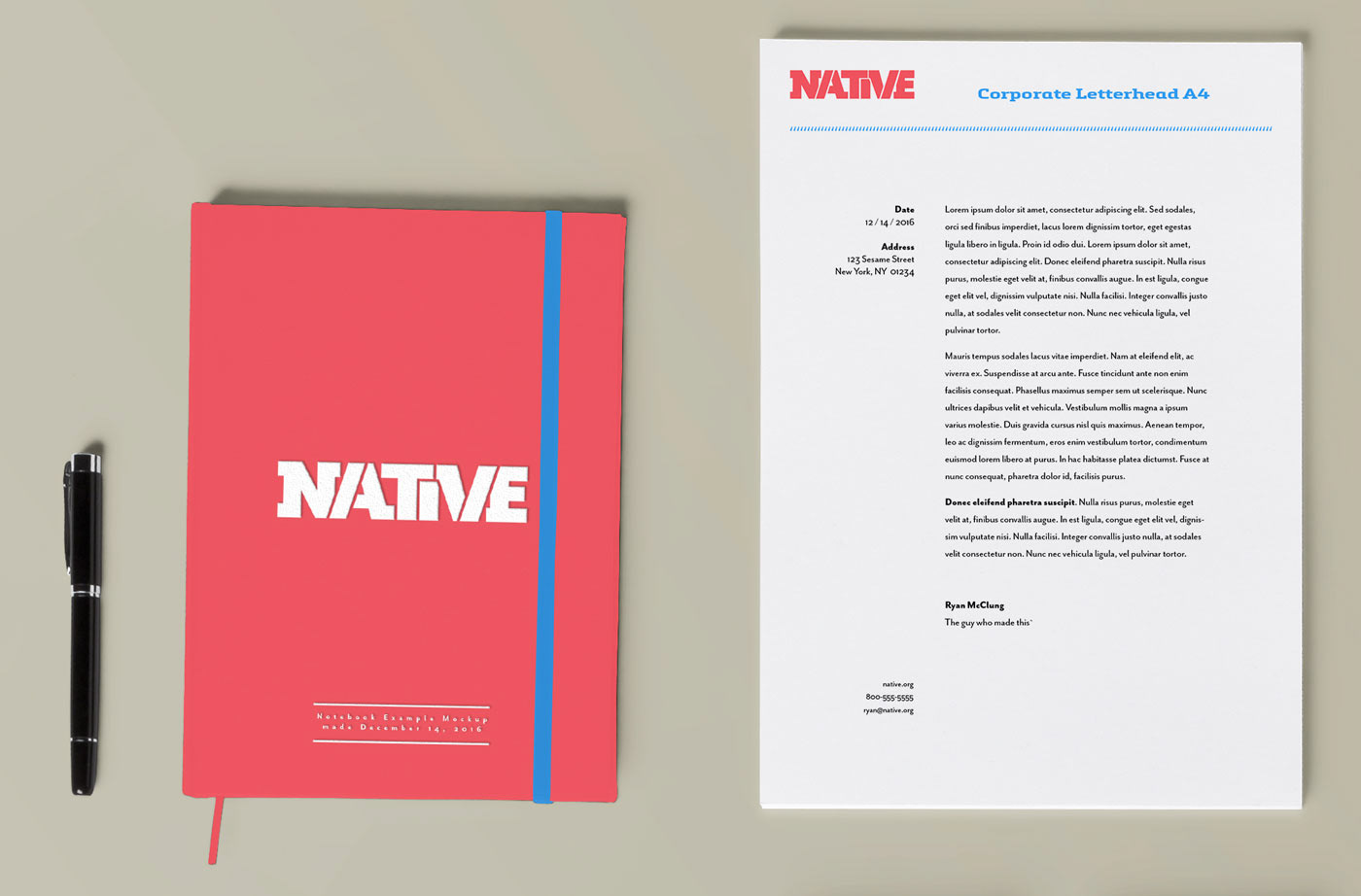
Stationery uses a more subdued treatment while retaining the identity’s core visual relationships.

Establish a common visual language.

The brief called for helping people understand government functions and find the appropriate agencies, particularly when time and resources are limited. The work shown is an academic proposal; it does not represent an implemented campaign or measured change in civic participation.

Make participation feel personal.

I proposed Native to connect the campaign with ownership and belonging, while moving away from the crowded field of civic- and citi-based names. The brand board focuses the broad brief on socially engaged young adults.

A modified slab-serif mark conveys strength and structure. Its upward angle expresses progress, while the broader palette offers an energetic alternative to the category’s familiar blue.

Explore the original brand-development board

Naming, audience focus, typography, and palette rationale from the academic project.

Native — Make participation feel personal., visual 1

Extend the idea through motion.

The animation studies develop the logo’s themes of togetherness and forward/upward mobility. Different color treatments and motion backgrounds explore how that idea can retain its character across changing visual contexts.

Extend the idea through motion.

Loads content from an external media provider.
Open media in a new tab ↗

Extend the idea through motion.

Loads content from an external media provider.
Open media in a new tab ↗

Extend the idea through motion.

Loads content from an external media provider.
Open media in a new tab ↗

Adapt the expression.

Stationery takes a more subdued approach for internal communication and business relationships. The tone changes with the use, while the central visual language remains recognizable.
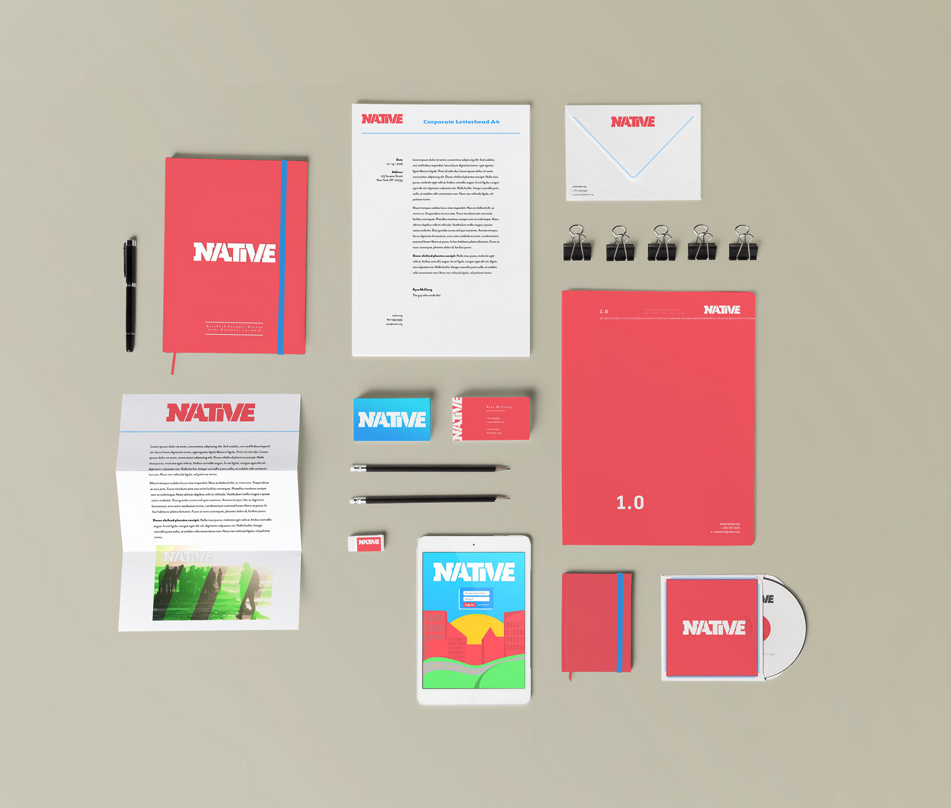
Native — Adapt the expression., visual 2
Native — Adapt the expression., visual 3
Native — Adapt the expression., visual 4
Native — Adapt the expression., visual 5
Native — Adapt the expression., visual 6
Native — Adapt the expression., visual 7
Next projectRock the Rock Concert View all work