← Selected workIdentity, typography & presentation / 2015–2016

Selected Design Studies

Different formats. A clear point of view.

Some design problems are best understood through the work itself. This collection brings together my identity, poster, and presentation studies—from expressive theatre graphics to distinctive wordmarks and a supporting toy-brand proposal. Each selection shows how I use concept, typography, hierarchy, and production choices to give an idea a clear visual form.

My contribution
Concept development, identity and poster design, brand presentation
Project context
Selected projects and design exercises
01 / Poster design exploration

Shakespeare: concept & type.

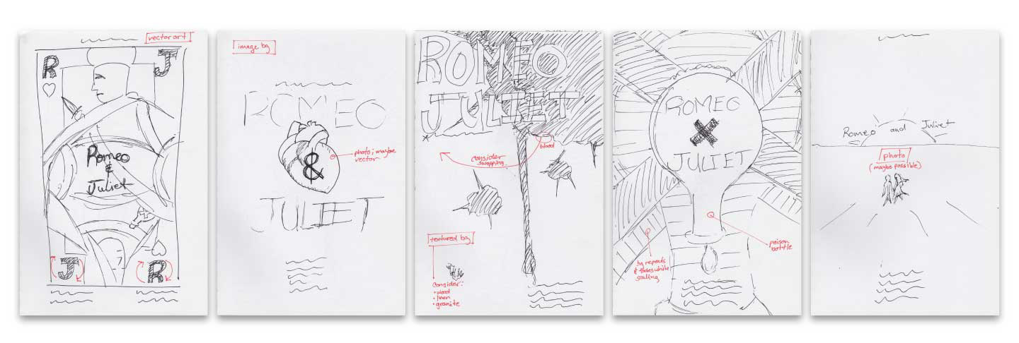
The Romeo and Juliet studies move from five rough ideas to two developed directions, with feedback recorded between stages. A playing-card composition and an anatomical-heart treatment offer contrasting interpretations of the same play.

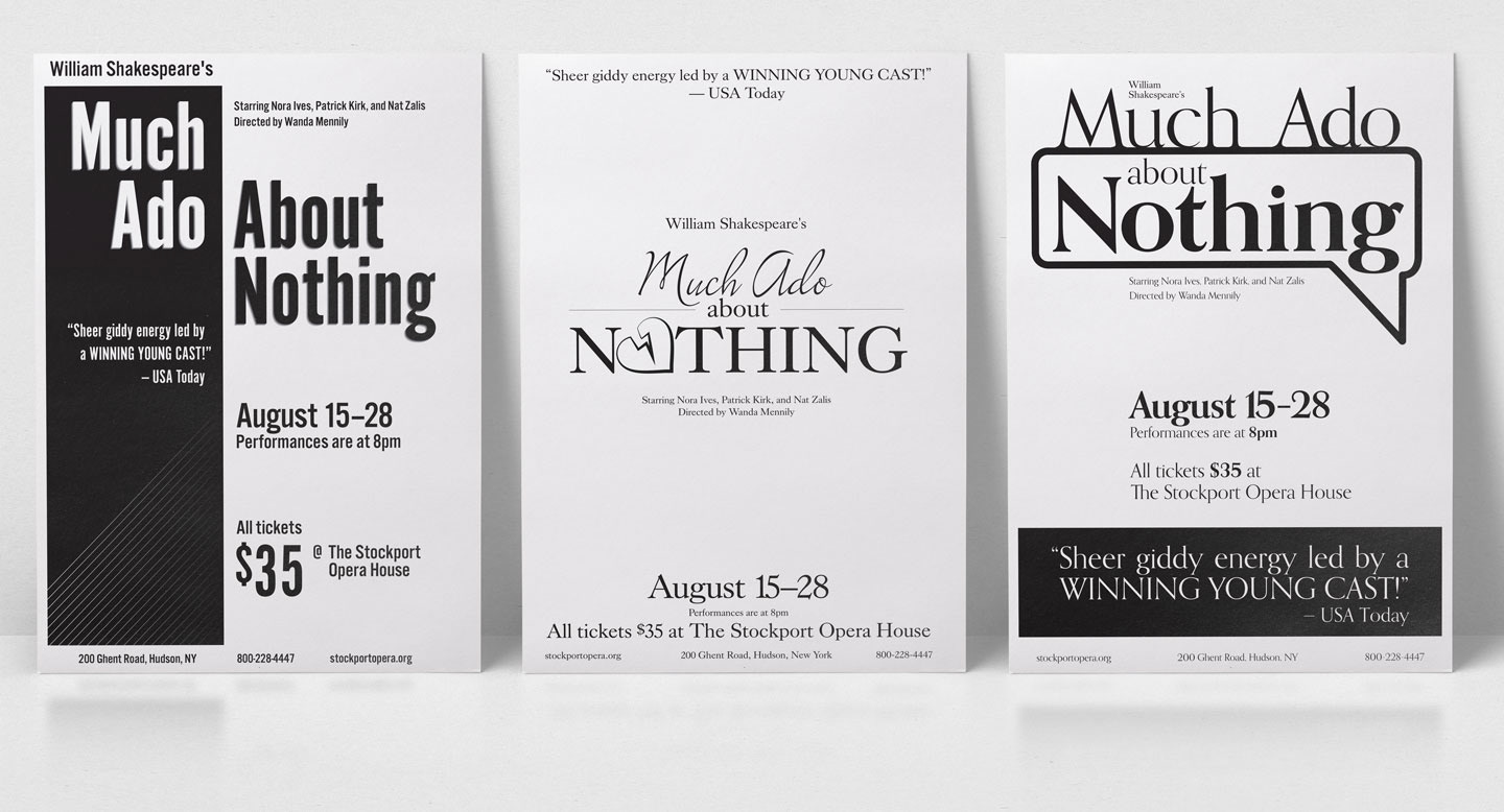
The Much Ado About Nothing exercises shift the emphasis to typography: fixed copy, grayscale, no photography, and minimal illustration. The challenge is to make hierarchy and type carry the message.
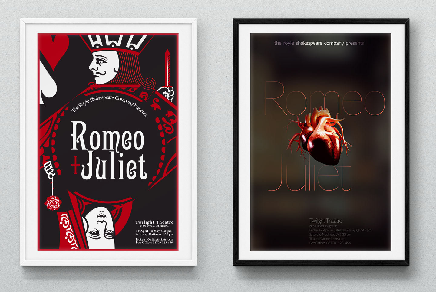
Two Romeo and Juliet poster concepts: a red and black playing card, and a heart integrated with title typography
See concept selection and refinement
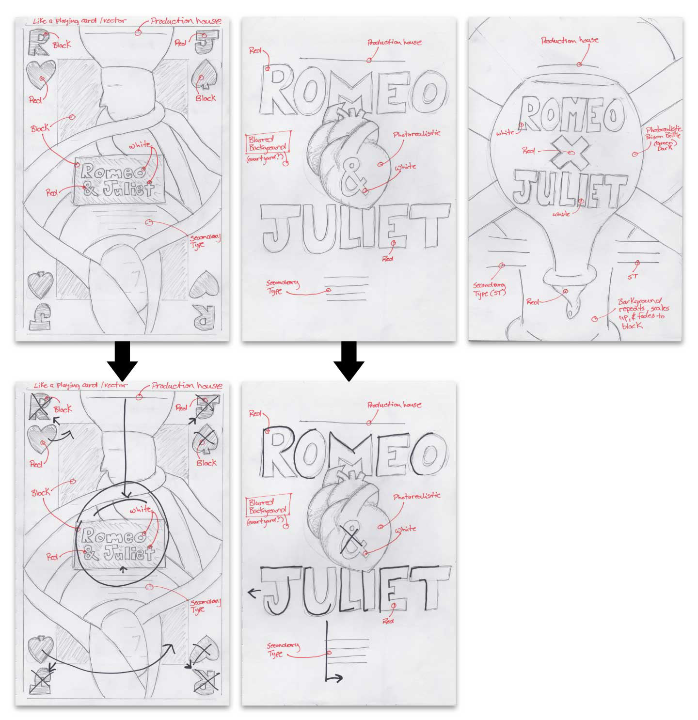
Five initial Romeo and Juliet poster sketches with concept and production notes
Annotated sketches showing three Romeo and Juliet concepts narrowed to two and refined through feedback
Three Much Ado About Nothing poster studies using contrasting typographic hierarchies in black and white
Three approaches to the same copy and grayscale constraints.
02 / Identity studies

Selected marks.

Two different typographic expressions, presented as compact identity studies.
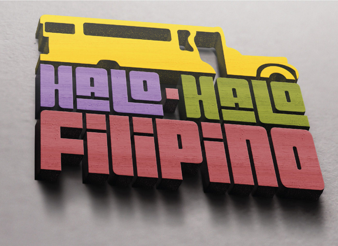
Halo-Halo Filipino multicolored wordmark with a yellow vehicle silhouette, presented as dimensional lettering

Halo-Halo Filipino

A logo for a print and web publication. A compact, multicolored arrangement and dimensional presentation give the mark a playful character.
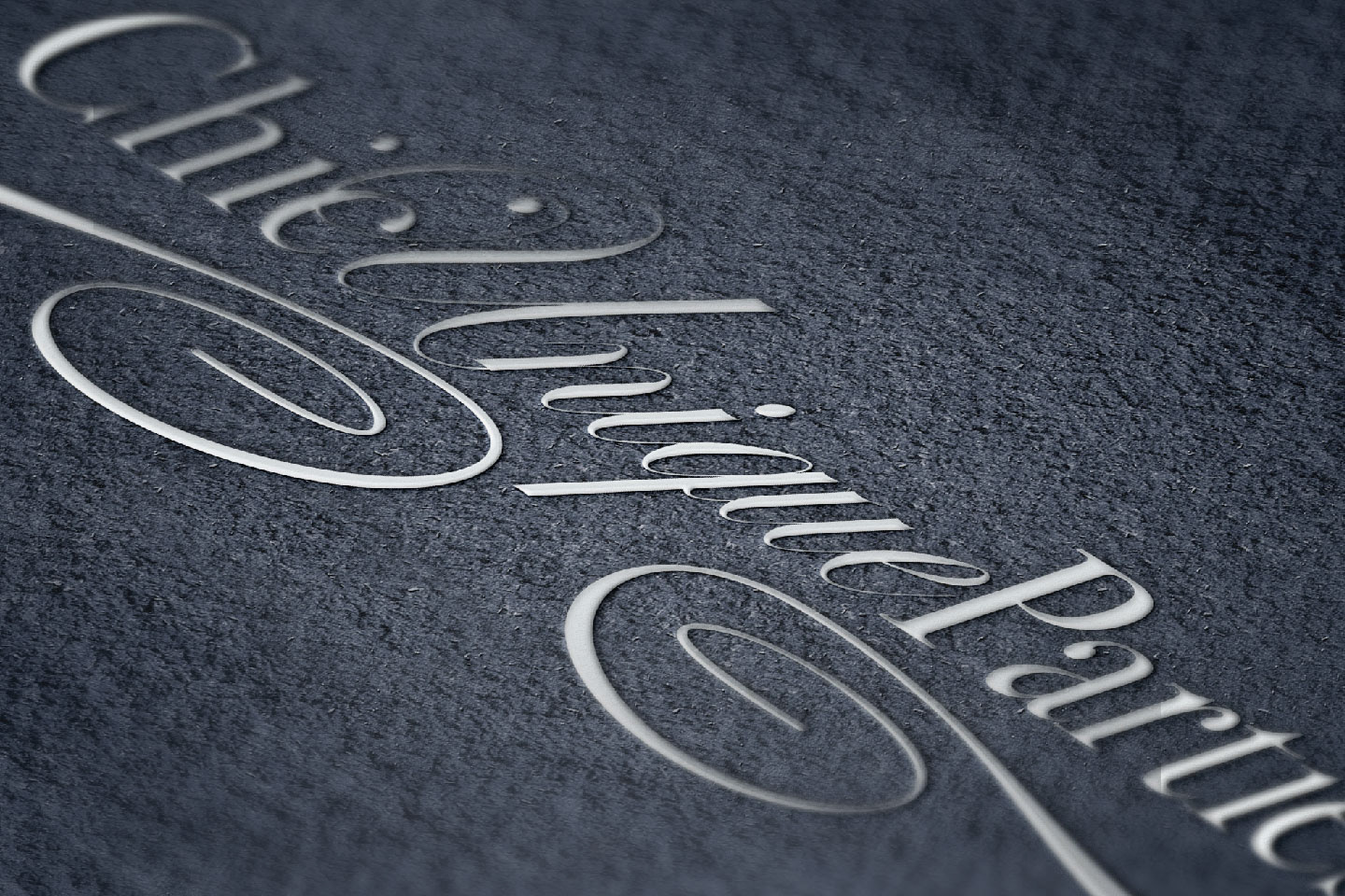
Chic Unique Parties script wordmark with extended letterforms, shown in a dimensional oblique mockup

Chic Unique Parties

A script-led wordmark with extended letterforms and flourishes. Its restrained color and dimensional finish provide a contrasting typographic expression.

03 / Additional brand exploration

Rainy Day Toys

View study

A fictional toy-brand proposal exploring growth and imagination through a flexible mark, a playful palette, and a concise strategy presentation.
Rainy Day Toys identity: colored blocks, a purple wordmark, and the tagline Growing Imagination
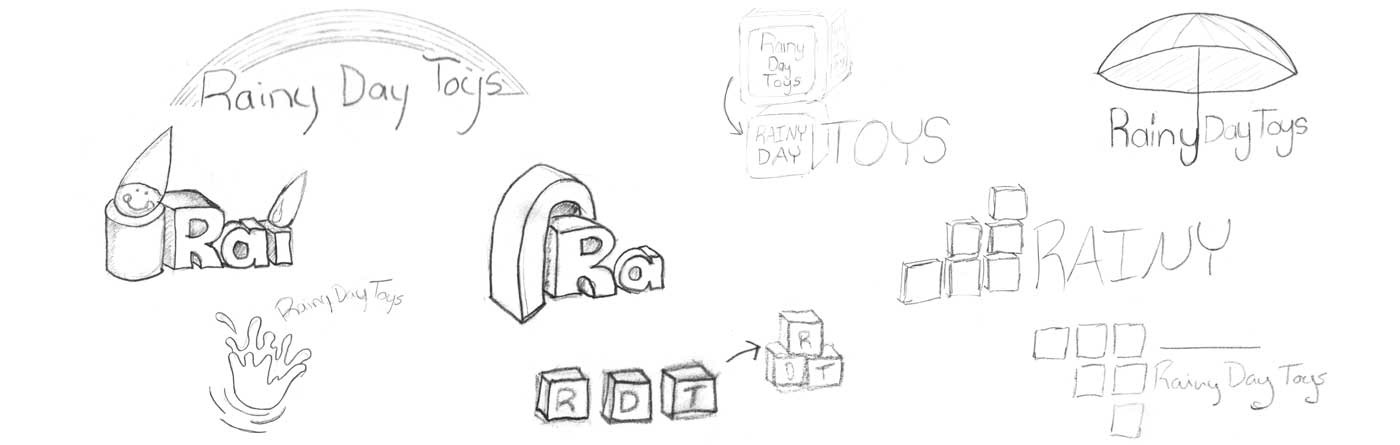
Sketches and identity variations
Early Rainy Day Toys logo sketches
Flexible block-based Rainy Day Toys identity study
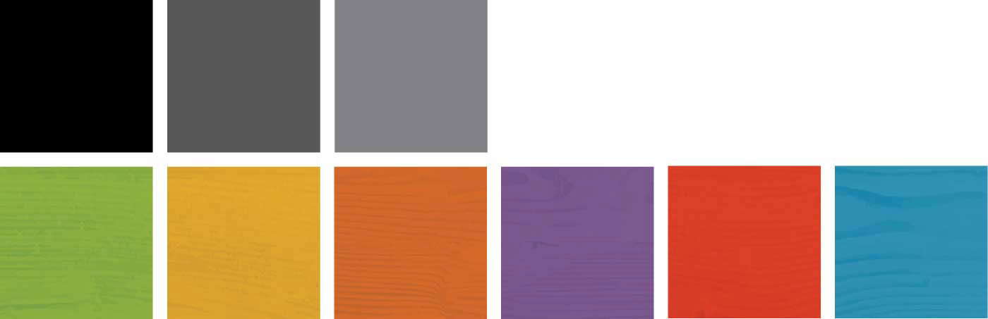
Colorful textured palette for the Rainy Day Toys concept
Watch the strategy presentation

Presentation overview: A parent-focused positioning proposal connecting childhood development and imagination with a flexible mark, typography, and color.

Continue exploringFood Bank NYC View all work