← Selected work
Brand strategy & identity / 2022

VRH Aviation Construction Specialists

A specialist’s identity, built from the inside out.

VRH had a specialist story to tell in a crowded construction market. Working with Howard York of York Branding, I helped develop a brand strategy and visual identity that made its aviation focus explicit, then extended the system into standards, print, digital, and physical applications.

My contribution
Brand strategy & identity development with Howard York / York Branding
Design focus
Make an aviation specialist recognizable in a broader construction market.
Decisions behind the work
01

Listen before positioning

Leadership, management, and front-line interviews established how the company understood itself.

02

Make specialization visible

Industry research focused the positioning on aviation construction rather than general construction.

03

Design for continued use

Alternate marks, sub-brand relationships, and standards extended the identity across practical applications.

VRH Aviation Construction Specialists — VRH Aviation Construction Specialists, visual 1

Find the meaningful distinction.

Conversations with leadership, management, and front-line teams established the company’s culture and capabilities. Industry research then identified aviation construction as a distinctive focus.

That understanding shaped the vision, mission, positioning, and attributes before the visual identity took form.

Translate the positioning into form.

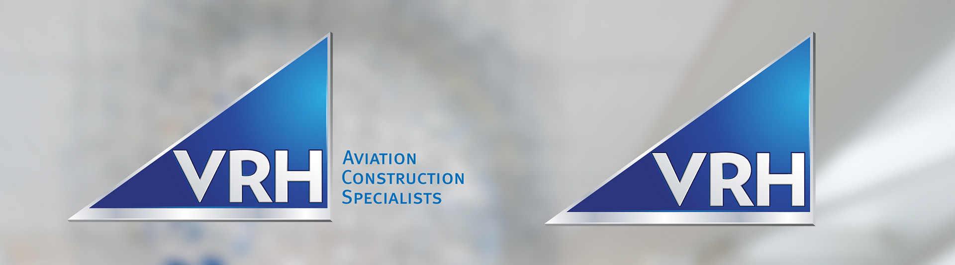
The triangular mark suggests upward movement and aviation. Acute angles, a metallic finish, and a heavy sans-serif wordmark express the intended combination of technical capability and dependability. The clarifier makes the specialization explicit.
VRH Aviation Construction Specialists — Translate the positioning into form., visual 2
VRH Aviation Construction Specialists — Translate the positioning into form., visual 3

Plan for real applications.

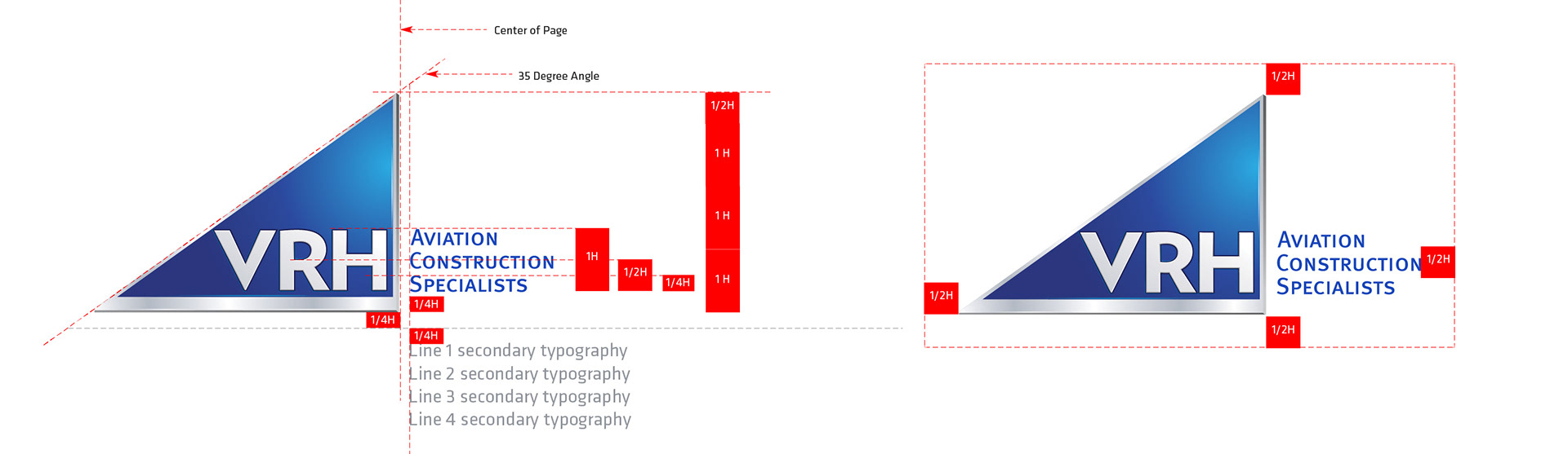
Alternate marks accommodate small sizes, single-color production, and applications where accurate color reproduction is unavailable.

VRH Aviation Construction Specialists — Plan for real applications., visual 4

Connect the sub-brands.

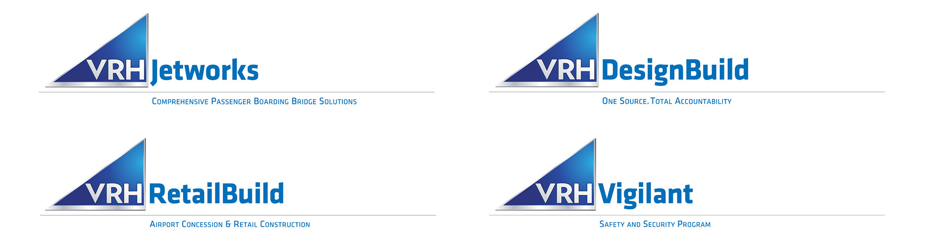
Related marks give specialist services their own focus while keeping them within a recognizable brand system.
VRH Aviation Construction Specialists — Connect the sub-brands., visual 5

Differentiate the visual language.

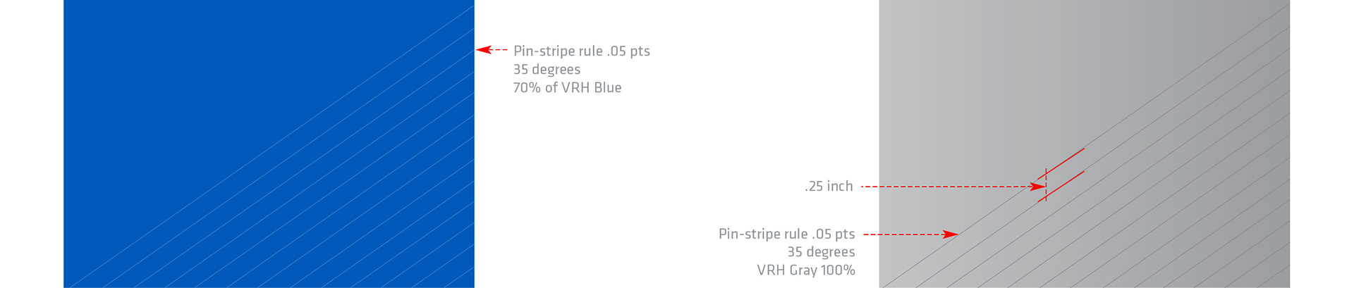
Research showed a prevalence of red in the construction category. The blue and metallic palette offers a different direction, drawing on sky and construction materials. A repeating angle carries the mark’s sense of lift into texture.

VRH Aviation Construction Specialists — Differentiate the visual language., visual 6
VRH Aviation Construction Specialists — Differentiate the visual language., visual 7

Carry the character into type.

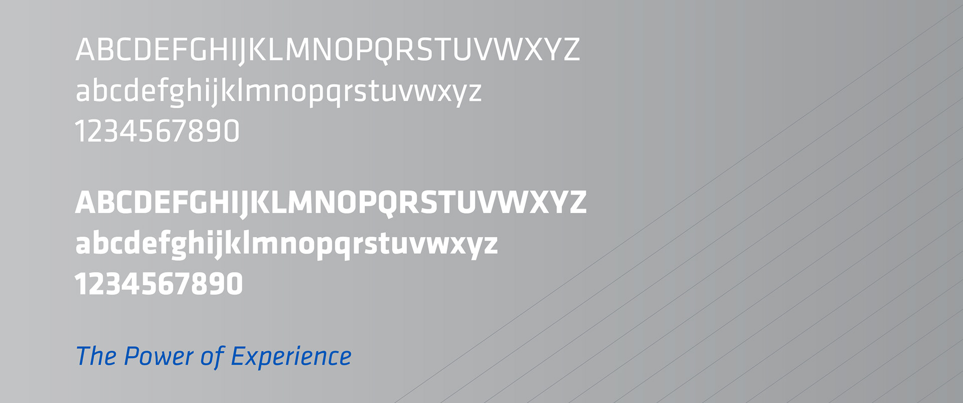
Klavika Basic’s architectural forms and broad family support a consistent voice across communications.
VRH Aviation Construction Specialists — Carry the character into type., visual 8

Make the system usable.

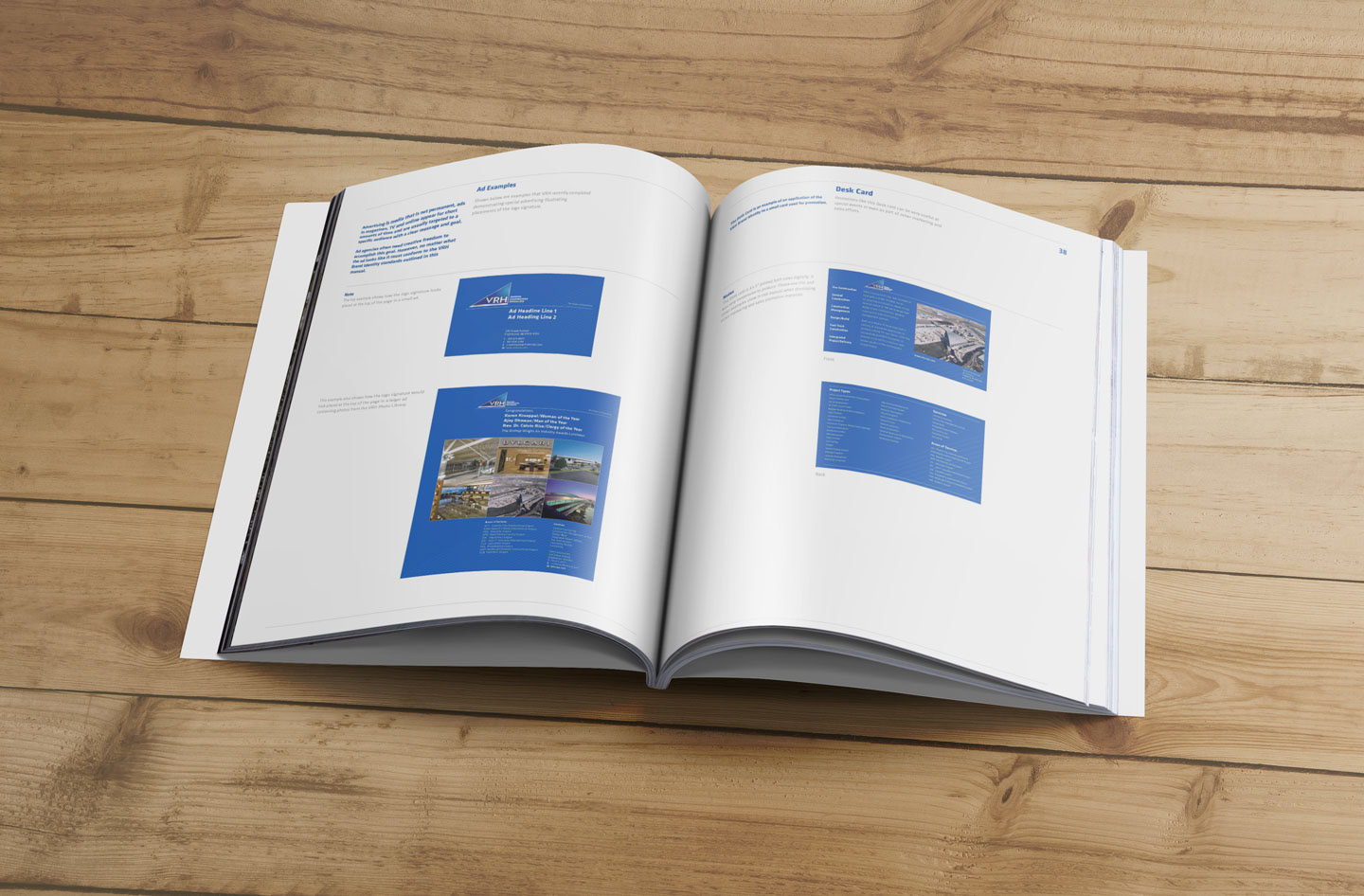
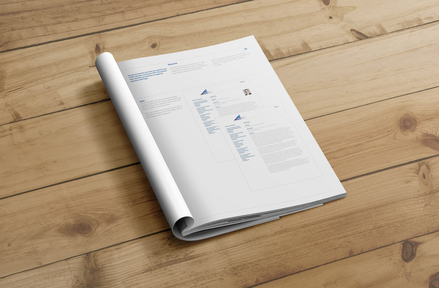
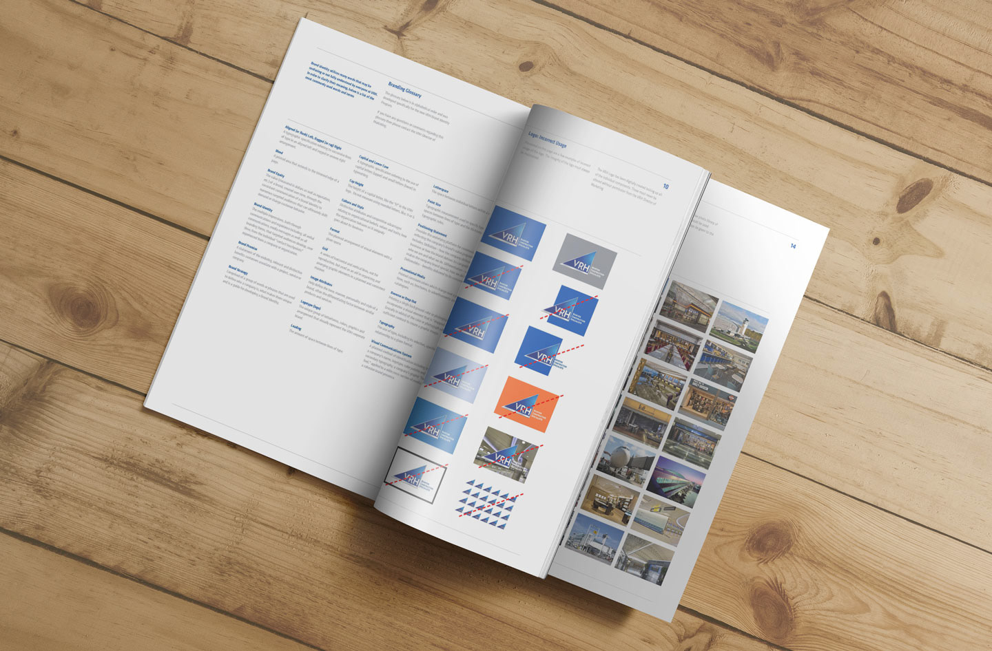
A graphic standards manual translates the identity into guidance for the people producing future materials.
VRH Aviation Construction Specialists — Make the system usable., visual 9
VRH Aviation Construction Specialists — Make the system usable., visual 10
VRH Aviation Construction Specialists — Make the system usable., visual 11
VRH Aviation Construction Specialists — Make the system usable., visual 12

Extend the identity.

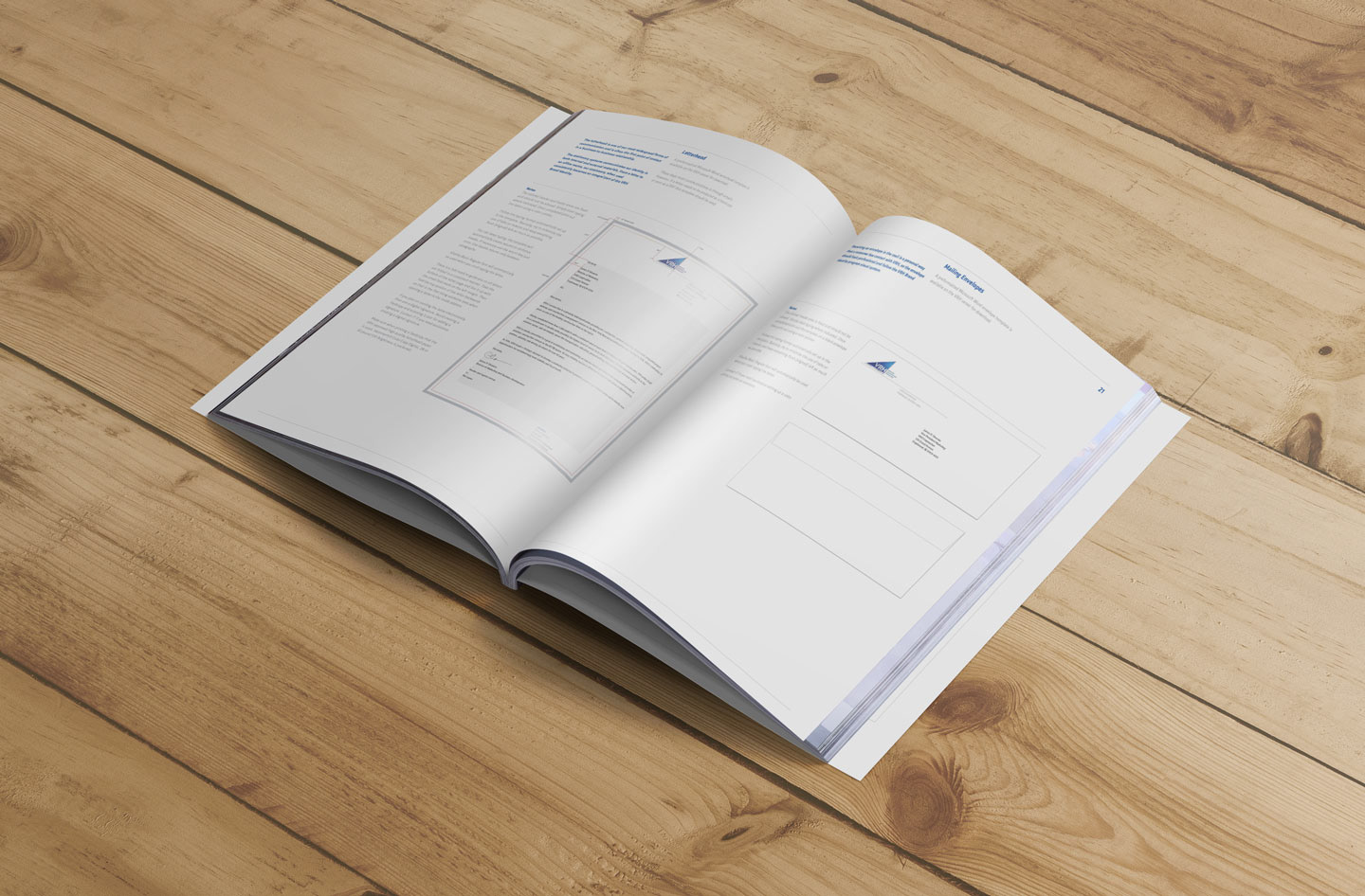
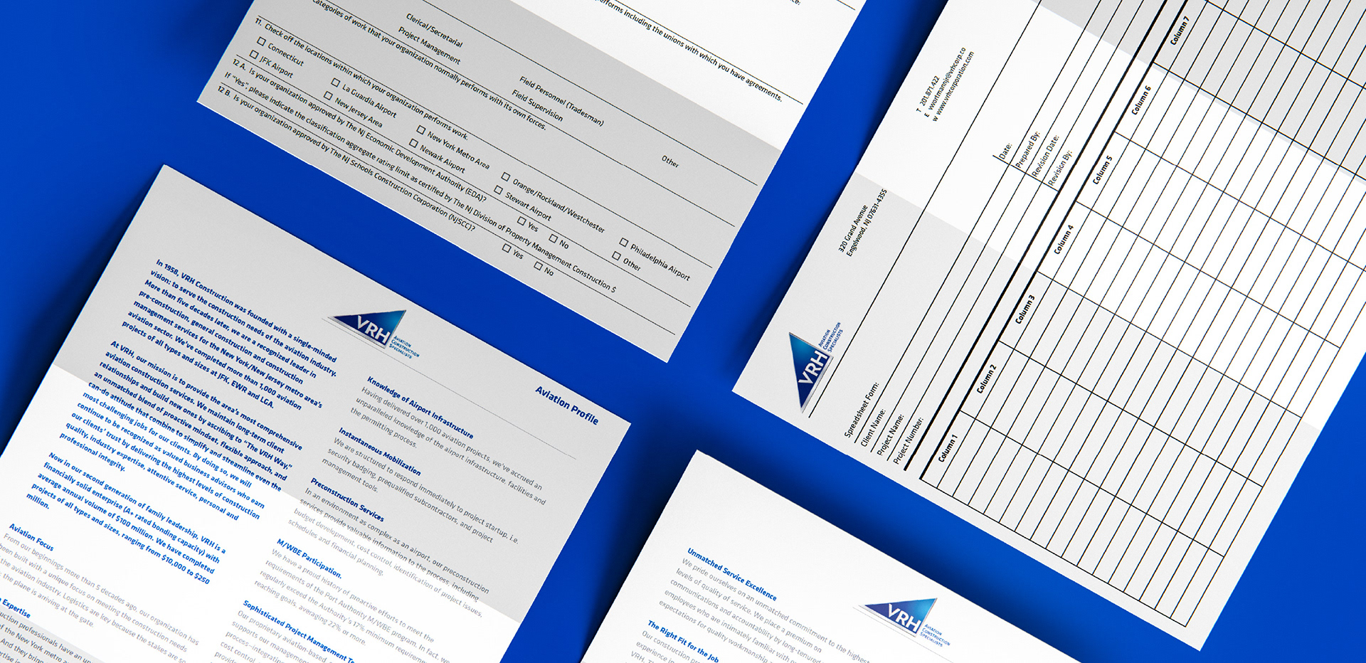
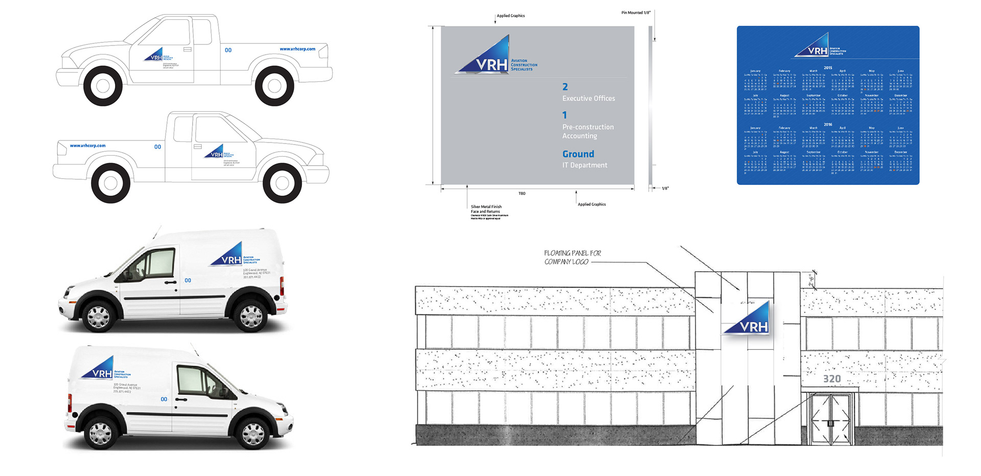
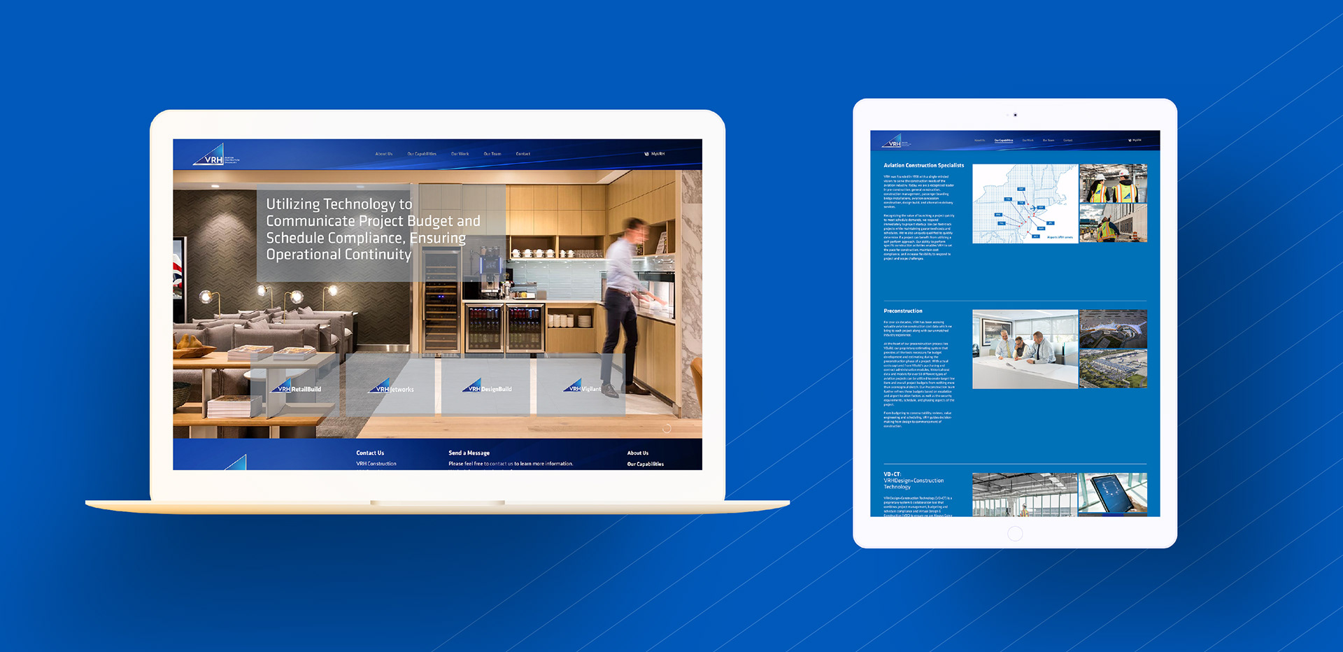
The selected applications show the system across stationery, document templates, physical environments, and the website. The relationship also included additional print, digital, apparel, signage, and promotional work.

Stationery
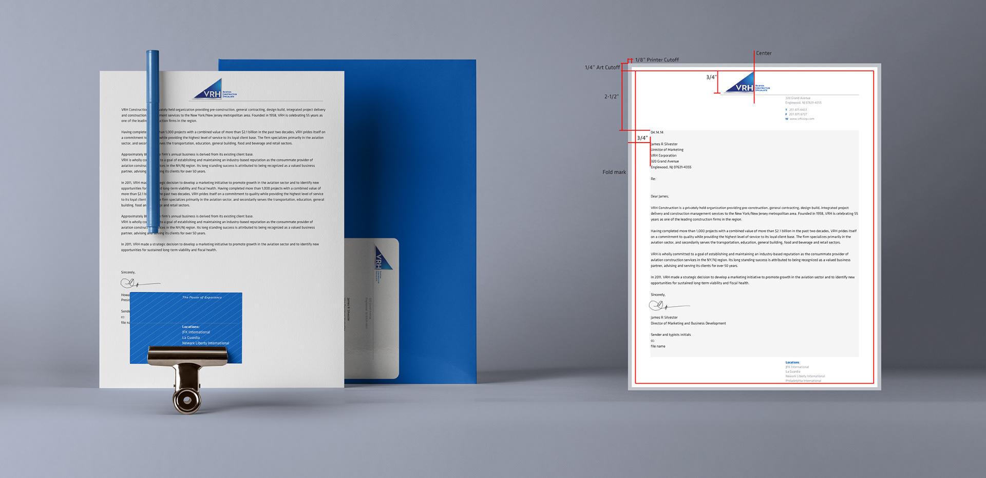
VRH Aviation Construction Specialists — Stationery, visual 13

Document templates

VRH Aviation Construction Specialists — Document templates, visual 14

Physical brand

VRH Aviation Construction Specialists — Physical brand, visual 15
VRH Aviation Construction Specialists — Website, visual 16
Next projectBalanced Body Labs View all work