Working with Howard York of York Branding, we developed a brand identity for New Jersey-based construction company VRH that evolved the brand from a me-too construction company into the premiere aviation construction company they are today.
The process began with a series of on-site and remote conversations with corporate leadership, followed by in-depth interviews with management and front-line team members to gain a solid understanding of the corporate culture and the brand as it was viewed internally. Following this, research was conducted to better understand the local construction industry, which led us to identify aviation construction as a relatively blue ocean market, and one in which VRH was excelling beyond anything the competition could offer.
With an understanding of who and what the brand is, their history, and competitive landscape, we began transforming the brand from VRH Construction to VRH Aviation Construction Specialists by developing a brand strategy that defined the company’s vision, mission, positioning, and attributes. With those key pieces of the identity appropriately defined, the visual identity followed naturally.
Below is a collection of brand communication collateral developed for VRH, much of which was produced for the initial rebrand launch, with many more assets developed throughout our years-long relationship with this amazing company.
Primary Logo
The triangular container that forms the silhouette of the mark represents forward, upward loft, directly related to the aviation industry that VRH supports. It’s hard, acutely angular edges and metallic finish communicate the company’s modern approach to aviation construction while all the elements together present a solid, dependable foundation for the construction services the company offers. The paired wordmark is presented in a heavy, sans serif typeface that bolsters these attributes, while the clarifier reinforces the company’s primary market focus and attention to specialization.
Alternate Logos
Though the primary logo is intended for use in most applications, it will not work where accurate color reproduction is not possible, smaller logo applications are needed, or where single-color renderings are required. As such, a series of alternate logos were developed to accommodate the brand’s various needs.
Sub-Brand Logos
As an aviation construction company with a focus on technology, safety, and continuity of services, they manage a collection of sub-brands that serve to provide absolute focus on their areas of expertise. To accommodate this, logos were produced for each of these sub-brands, along with direction for their application and considerations within the greater brand ecosystem.
Color Palette and Texture
Through extensive research, it was found that the industry relies predominantly on shades and hues of red for their primary palette. For differentiation purposes, VRH’s primary palette steers away from this cliché, instead opting for a palette that conveys strength, dependability, and clarity while hinting at the metals used in the craft and the blue sky above. The pin stripe texture picks up the 35-degree angle of the mark, reinforcing the perception of movement and loft.
Typography
The brand’s typography relies almost entirely on Klavika Basic. With its architectural, modern sans serif styling and broad family, Klavika Basic proved the perfect typeface for use in conveying the brand’s messaging.
Graphic Standards Manual
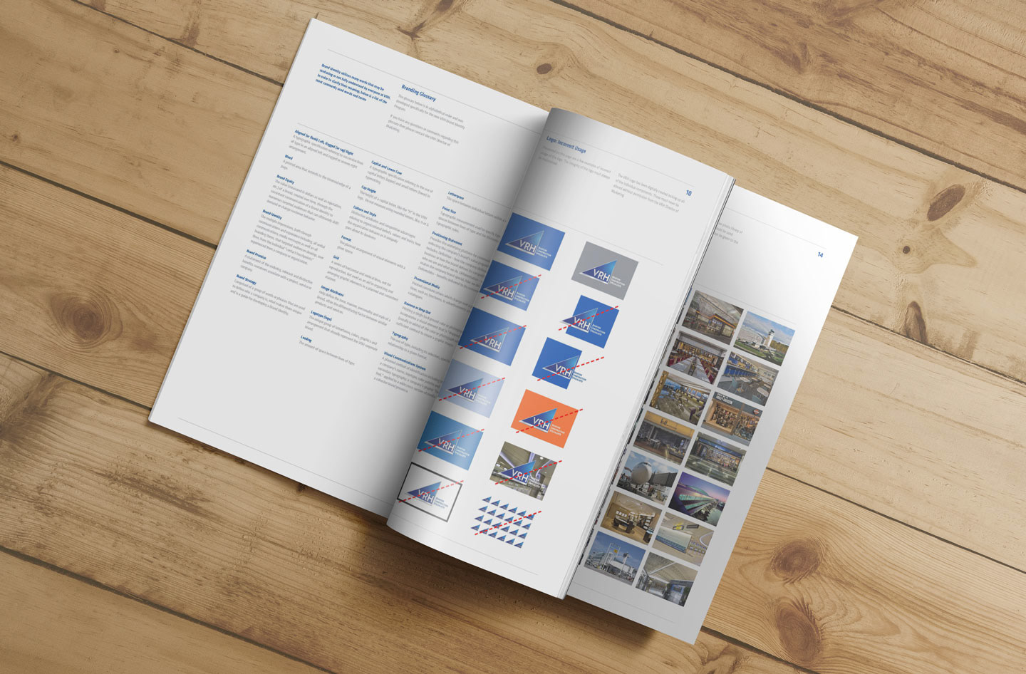
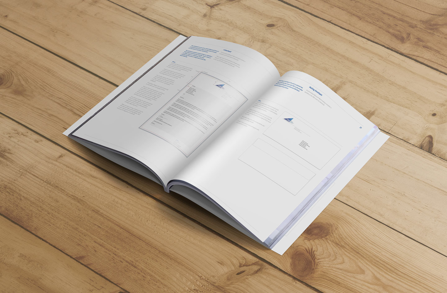
No brand identity design is truly complete without the production and delivery of a standards manual that guides current and future stakeholders in the proper stewardship of the brand. Thus, a Graphic Standards Manual was developed to educate these stakeholders, providing a straightforward, easily referenced means of ensuring brand integrity now and throughout the identity’s lifespan.


Collateral
The following represent a small collection of brand identity applications selected from the large set of collateral produced for VRH. Beyond this sampling, additional collateral such as in-house application design, signage, apparel, promotional items, contracted video production, and many additional print materials were designed and developed.
Stationery
Document Templates
Physical Brand
Website